Interpreting Dot Plots
Activity Description
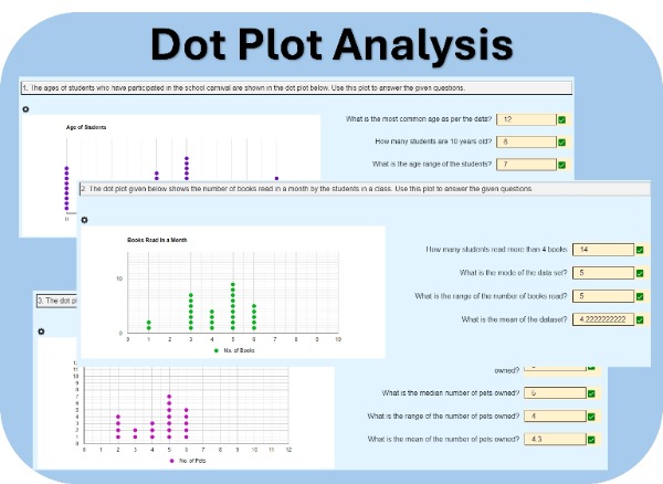
In this worksheet, students will engage in analyzing dot plots that represent real-world data scenarios. For example, one of the plots may show the ages of students who participated in a school carnival. Students will carefully examine these plots and answer a series of questions designed to deepen their understanding of data distribution and statistical measures.
Activity Overview:
- Real-World Data Analysis: Students will work with dot plots that depict real-life situations, such as age distributions at a school event. This helps students relate mathematical concepts to everyday experiences.
- Three Unique Sets of Data: Each student will be provided with three different dot plots, each accompanied by a set of questions.
- Answering Targeted Questions: Students will analyze the dot plots to answer questions related to the data.
Key Features:
- Auto-Graded: This interactive digital worksheet is auto-graded, eliminating the need for teachers to evaluate it manually, making it an excellent practice activity.
- Unique Questions: Each student will receive a unique set of 3 dot plots to promote individual practice and understanding.
- Re-Assignable: Re-assigning the worksheet to the same classroom will generate a new set of questions for each student.
Learning Objective
Students will interpret and analyze dot plots to determine key statistical measures, including mode, mean, median, and range. They will also answer contextual questions to develop fluency in reading and reasoning with data representations.
Our New Math Platform
Explore more of our math worksheets on our new dedicated platform: TeachRealMath.com.
No action is needed from your side — your existing assignments will remain accessible, and you’ll be able to log in to TeachRealMath.com using the same credentials.
Explore the new platform to find all your math activities and more!